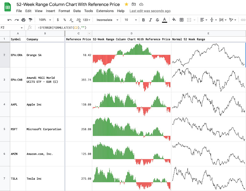
Use SPARKLINE to create 52-week range price indicator chart for stocks in Google Sheets
The 52-week range price indicator chart shows the relative position of the current price compared to the 52-week low and the 52-week high price. It visualizes whether the current price is closer to the 52-week low or the 52-week high price. In this post, I explain how to create a 52-week range price indicator chart for stocks by using the SPARKLINE function and the GOOGLEFINANCE function in Google Sheets.

Table of Contents
If my work has been helpful to you 🙏

Concept
With the GOOGLEFINANCE function, it's possible to retrieve the current price, the 52-week low price, and the 52-week high price of a stock by using the below formulas:
=GOOGLEFINANCE("AAPL")returns the latest price of APPLE stock=GOOGLEFINANCE("AAPL","low52")returns the 52-week low price of APPLE stock=GOOGLEFINANCE("AAPL","high52")returns the 52-week high price of APPLE stock
To measure the relative position of the current price compared to the 52-week low price and 52-week high price, I compute a ratio that I call the 52-week range ratio. It is the result of dividing the difference between the current price and the 52-week low price by the difference between the 52-week high price and 52-week low price.
52-week range ratio = (current price - 52-week low price) / (52-week high price - 52-week low price)- The bigger this 52-week range ratio is, the closer to the 52-week high price the current price is. The max value for this 52-week range ratio is 1.
- The smaller this 52-week range ratio is, the closer to the 52-week low price the current price is. The min value for this 52-week range ratio is 0.
To visualize effectively the 52-week price range as a miniature chart within a single cell, I use the SPARKLINE function with the configurations as below:
=SPARKLINE(G2,{"charttype","bar";"max",1})
- I provide only the 52-week range ratio as data for the chart.
- I specify bar as the charttype option of the SPARKLINE function.
- I specify 1 for the max option of the SPARKLINE function.
As a result, the 52-week range price chart looks like a progress bar within a single cell.
- If the current price is close to the 52-week high, the 52-week range price chart is about fully filled with the color of choice.
- If the current price is close to the 52-week low, the 52-week range price chart is about empty.

Demo

Conclusion
In this post, I explained how to use the SPARKLINE function and the GOOGLEFINANCE function to create 52-week range price charts for stocks in Google Sheets. With the SPARKLINE function, I have made other charts to help watch the movement of stocks. I will write about them in future posts.
This post is part of a series of posts about effectively using the SPARKLINE function and the GOOGLEFINANCE function for managing a stock investment in Google Sheets.


Disclaimer
The post is only for informational purposes and not for trading purposes or financial advice.

Comments
Post a Comment